1
2
Tattoos image 20 of 20
 02.16.16
By Damion Cressy
 02.16.16
Tattoos by Damion Cressy
Rapid City South Dakota ,
Rapid City South Dakota ,
Request Tattoo Appointment from Damion Cressy
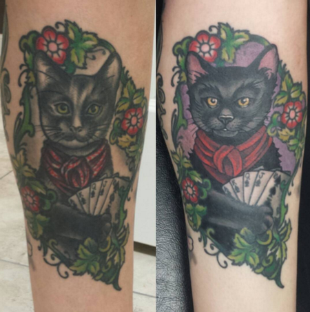
- 605-430-1380She wasn't too happy with the cat, but liked the overall design and the framework so we left the frame alone.
I freehanded the face from a reference photo of her cat to give the face better structure while maintaining the simple neotraditional style that she was looking for. I also simplified some features like the bandana for better clarity and bolder color, and added strong solid black in select areas to boost the contrast and bring attention to the face and cards.
This was a fun one, I like taking things people are embarrassed by and turning them into something that makes them happy!