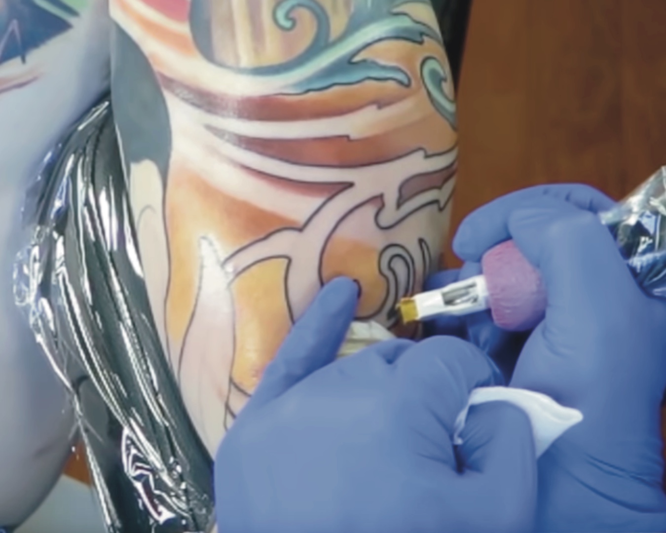
Color Transitions - Jake Meeks
Submitted 11.01.23

Color Transitions

“I started with a medium tone… I’m working kinda medium to dark, rather than working dark to light.”
- Jake Meeks
It's all about getting the transition points correct when it comes to achieving smooth color transitions. I find that placing the highest saturation points where those transitions are I'm able to avoid muddy and confused colors. Experiment with the order in which you're packing your colors too. Going from light to dark, or from mid tones, to dark, to light will result in distinct effects, so play around until you find something that works for you.
