Covering up Bad Tattoos An Attempt at Solving the Problem - Jake Meeks

Covering up Bad Tattoos
An Attempt at Solving the Problem
“The first thing I did was to introduce these sweeping leaf shapes in an attempt to lift the viewer's eye and move it through the composition…”
- Jake Meeks
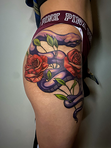
My first goal with this piece was to introduce some secondary element that would break the hard horizontal shapes that the previous tattooer had introduced. I chose to use a few very simple leaf shapes to solve this problem. I wanted to be sure that the leaves looked as if they were part of the original design, so I had some of the leaves fall behind the snake and others fall in front of it. This required that I tattoo right over the harsh lines of the snake, which wasn’t ideal, but sometimes we have to sacrifice perfection in order to make some progress.
I was able to distract from most of the bad linework by introducing a strong light source and turning the outlines into edges/transitions. Most of my problems were solved (as much as they could be) before I introduced color. Here is a photo of the finished piece.
While the tattoo still has issues (I never was able to completely solve the problem with the roses) I feel like overall I was able to successfully distract the viewer from the shortcomings of the piece by establishing a hierarchy within the composition. By using strong value contrast and a deliberate light source on the body of the snake, attention is pulled away from the weakest areas of the tattoo and focused on the strongest parts.
Watch the full episode:
The Most Common Problem with Bad Tattoos
(and how to Fix it)
| Fireside Technique |
