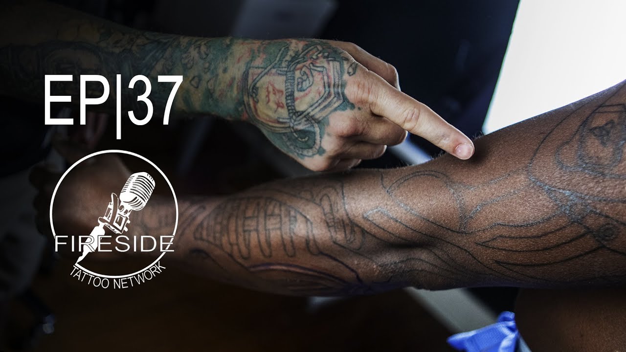
Simplifying Shapes in Tattoo Designs to Read Clearer on Darker Skin

Simplifying Shapes in Tattoo Designs to Read Clearer on Darker Skin
“… that’s the goal, simplifying the shapes because what we want when this thing is settled in and he’s lived with it for a couple of years… you want the shapes themselves to be super clear, super easy to read and draw you in so that... so you want to look closer.” – Jake Meeks
Making large, bold shapes is more important than ever when working with darker skin tones. Because we have such a limited range to work with in our transitions, we need to make sure our shapes are very clear and visible to help boost their structure.
Making Deliberate Decisions
“And the mistake I think that’s most common to make is… you’ll tend to want to come through and really add all these subtle little transitions and lights and darks, and what that tends to do is flatten the image out over time…” – Jake Meeks
Unintentionally, we can make the piece more flat if we're not careful with our value decisions. We can avoid flattening out over time by defining our lights and darks clearly first, subtly adding transitions as needed will prevent the work from flattening out over the life of the tattoo.
Another thing you should consider is limiting the amount of planes you’re working with. This doesn’t just apply to darker skin, but simplifying to just foreground and background can make readability better on ALL skin tones.
